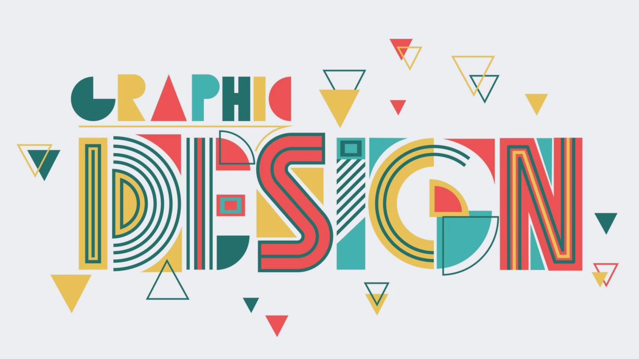
In today’s visually-driven world, graphic design plays a crucial role in capturing attention, conveying messages, and creating memorable brand experiences. At Fuzebox Media, we understand the power of graphic design principles in crafting stunning visual representations that resonate with audiences. Let’s explore how Fuzebox Media leverages these principles to create exceptional designs and help businesses stand out in a crowded marketplace.
Balance:
Balance is a fundamental principle of graphic design that creates visual stability and harmony. Fuzebox Media ensures that our designs achieve a sense of equilibrium by distributing visual elements, such as text, images, and white space, in a balanced manner. Whether it’s through symmetrical balance, where elements are mirrored, or asymmetrical balance, where elements are visually weighted, we create designs that feel pleasing to the eye and evoke a sense of professionalism and confidence.
Contrast:
Contrast adds visual interest and helps highlight important elements in a design. Fuzebox Media utilizes contrast to make key information or visuals stand out. Whether it’s through the use of contrasting colors, sizes, fonts, or textures, we create designs that grab attention and guide the viewer’s focus to the most critical elements. Contrast is a powerful tool in creating visual hierarchy and ensuring that the key messages are effectively communicated.
Typography:
Typography plays a significant role in graphic design, as it sets the tone, conveys the brand’s personality, and enhances readability. Fuzebox Media carefully selects fonts that align with the brand’s identity, ensuring they are legible and visually appealing. We pay attention to factors such as font styles, sizes, spacing, and hierarchy to create designs that are both aesthetically pleasing and easy to read. By leveraging typography effectively, we enhance the overall impact of the design and reinforce the brand’s messaging.
Color Theory:
Colors evoke emotions, convey meaning, and establish brand recognition. Fuzebox Media employs color theory to create designs that resonate with the target audience and reflect the brand’s identity. We carefully select color palettes that align with the brand’s personality, considering factors such as color psychology, cultural associations, and color harmony. By leveraging colors effectively, we create designs that evoke the desired emotions, capture attention, and leave a lasting impression.
Unity:
Unity ensures that all elements within a design work together cohesively to create a unified and harmonious visual experience. Fuzebox Media pays attention to consistency in design elements, such as styles, colors, and imagery, to establish a strong visual identity for the brand. By maintaining visual continuity across various touchpoints, we create a sense of professionalism and build brand recognition. Unity is key to creating a cohesive and memorable brand experience.
Simplicity:
Simplicity is often the key to impactful design. Fuzebox Media embraces the principle of simplicity by removing unnecessary clutter and focusing on essential elements. We believe in communicating messages concisely and effectively, allowing the design to breathe and resonate with the viewer. By simplifying complex ideas and distilling them into visually appealing designs, we ensure that the message is easily understood and remembered.
