Business Name in India

How to Choose the Perfect Business Name in India

(Step-by-Step Guide)
Business Name in India
Choosing a business name is one of the most exciting parts of starting up. There’s a rush the moment it clicks — you say it out loud, it sounds right, and suddenly it feels like the business is real.

But here’s the catch we see all the time at Fuzebox: founders fall in love with a name based purely on gut feeling, only to find out weeks later that the domain’s taken, the trademark already belongs to someone else, or the MCA won’t let them register it.

We’ve sat across the table from a founder who had already ordered visiting cards, packaging mock-ups, and a signboard design — all before checking if the name was even legally available. Two weeks in, a trademark search brought the whole thing to a halt, and the entire branding had to be rebuilt from scratch. It’s a completely avoidable situation, and it’s exactly why this checklist exists.

So before you fall too deep in love with a name, run it through these ten checks.

1. Define Your Brand Identity

Ask yourself:

  • What products or services do you offer?
  • Who is your target audience?
  • Should the name sound premium, modern, traditional, or technical?
  • Will it still work if you expand in the future?

A name should represent your vision — not just what you’re selling on day one.

2. Shortlist Multiple Names

Never fall in love with just one name. Build a list of 10–20 options and mix styles:

  • Invented names
  • Meaningful words
  • Latin or Greek inspiration
  • Combination names
  • Acronyms

The wider the shortlist, the easier it is to spot the one that actually earns its place.

3. Check MCA Availability

Planning to register a Private Limited Company or LLP? Check whether the name is already registered on the Ministry of Corporate Affairs (MCA) portal. If something similar already exists, your application can get rejected outright.

4. Search Trademark Availability

Even if the company name is available, the trademark might not be. Search the IP India Trademark database before you finalize anything — a trademark is what actually protects your brand identity long-term.

5. Check Domain Availability

Your website is your digital identity today. Before locking in the name, check availability for:

  • .com
  • .in
  • .co.in

A short, memorable domain is always worth prioritizing over a “cooler” but harder-to-type one.

6. Check Social Media Usernames

Verify availability across:

  • Instagram
  • Facebook
  • LinkedIn
  • YouTube
  • X (Twitter)

Owning the same username everywhere makes branding — and finding you — a lot easier for your audience.

7. Google the Name

Just search it. Ask yourself:

  • Is another known business already using it?
  • Does it carry any negative associations?
  • Will customers actually be able to find you and not someone else?
8. Easy to Pronounce and Remember

A good business name should be easy to say, easy to spell, easy to remember, and easy to recommend. If people stumble over saying it out loud, they’ll stumble over recommending it too — and word-of-mouth is often a startup’s cheapest marketing channel.

9. Think Long-Term

Avoid names that box you in. If there’s even a chance you’ll expand internationally, add new product lines, or pivot slightly, choose a name that still makes sense a few years down the line — not one tied to today’s single product.

10. Get Professional Feedback

Before you register anything:

  • Ask friends
  • Ask potential customers
  • Ask branding professionals

An outside perspective almost always catches something you’re too close to see.

Final Thoughts

Your business name is more than a word — it becomes your identity, your website, your social presence, and eventually, your reputation. Spending a little extra time getting it right upfront saves a lot of time, money, and legal headaches later.

At Fuzebox Media, we help startups and businesses with:

  • Business Name Research
  • Brand Strategy
  • Logo Design
  • Domain Registration
  • Website Development
  • Digital Branding

Need help choosing the perfect business name? Get in touch with Fuzebox Media, and let’s build a brand that stands out — right from the name up.
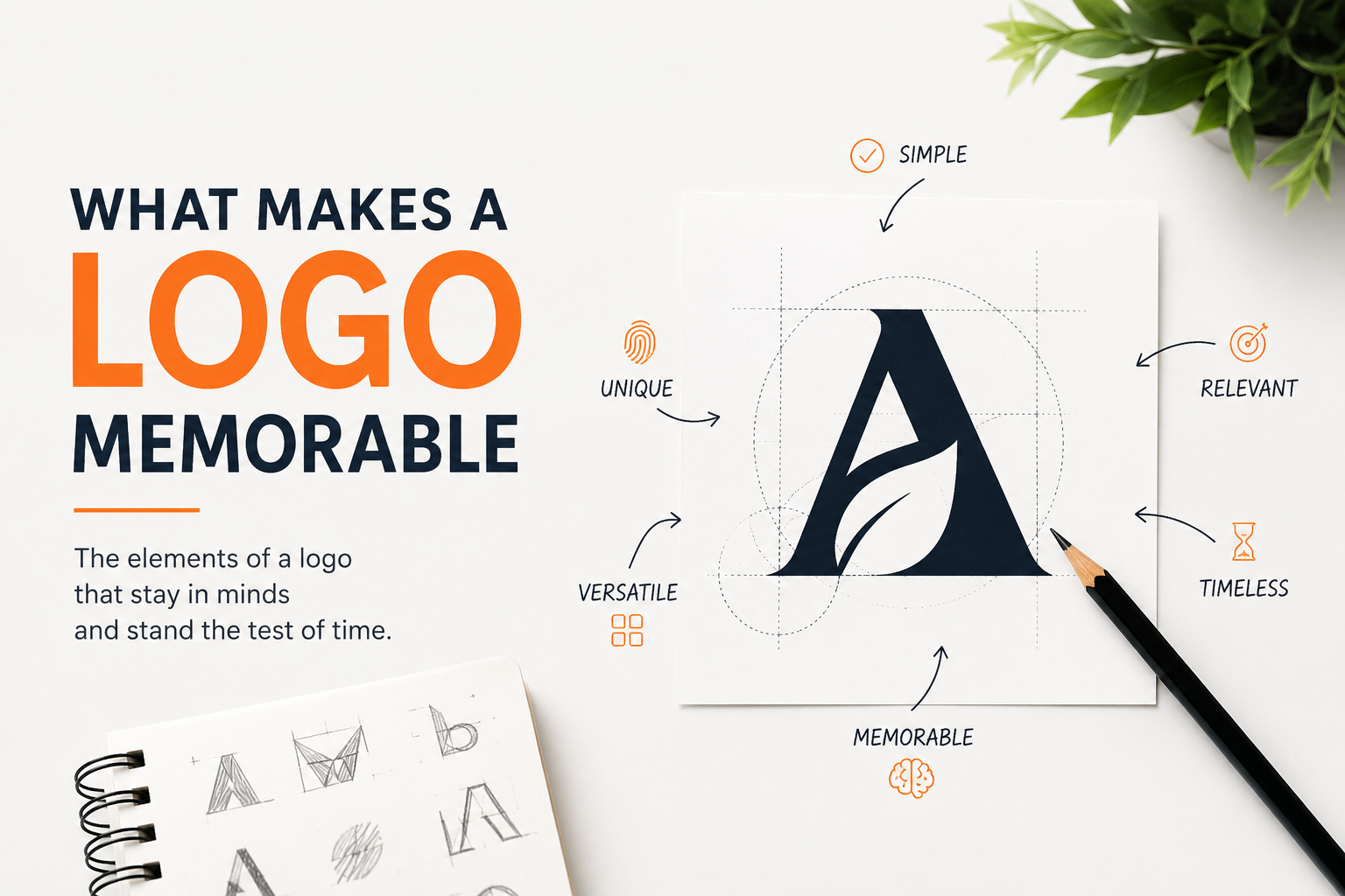
What Makes a Logo Memorable

What Makes a Logo Memorable?

What Makes a Logo Memorable

What Makes a Logo Memorable?

"A logo isn't just decoration. It's the first word your brand speaks — often before you get a chance to say anything at all."
Think about the logos burned into your memory. The golden arches. The swoosh. The bitten apple. None of them describe what the company does — yet you know exactly who they are. That's not luck. That's design working at its highest level. At Fuzebox Media, we work with businesses every day who want a logo that "looks nice." We gently push back. A logo shouldn't just look nice — it should be unmistakable. Here's what separates logos people remember from logos people scroll past.

RECOGNITION SPEED
400ms
How fast the brain identifies a familiar logo — faster than reading a word
BRAND COLOR RECALL
80%
Increase in brand recognition when consistent color is used across touchpoints
01Simplicity — the hardest thing to achieve
The most iconic logos are often the simplest. Simplicity makes a logo faster to recognize, easier to reproduce, and more versatile. If you can’t sketch it from memory after seeing it once, it’s probably too complex. Every element should earn its place. Think of Nike’s swoosh — a single curve drawn in seconds, worth billions in brand equity.
02 Distinctiveness — owning visual territory
A memorable logo looks like nothing else in its space. That means resisting trends and committing to a visual idea that’s genuinely yours. FedEx looks nothing like UPS. Apple looks nothing like Microsoft. Distinctiveness is what stops a thumb from scrolling — and what makes people say “I’ve seen that before.”
03 Relevancewithout being literal
A great logo feels right for its brand without spelling it out. Amazon’s logo doesn’t show a warehouse — it shows a smile and an arrow from A to Z, communicating customer happiness and breadth of range in one elegant swoop. A law firm doesn’t need scales. A tech company doesn’t need a circuit board. Evoke the feeling, not the function.
04 Versatility — alive in every context
Your logo will live on a website, a business card, a 10-foot sign, and a phone screen the size of a postage stamp. A strong logo works in one color, in black and white, at tiny sizes and massive ones. McDonald’s golden arches work on a motorway billboard or a takeaway bag. If your logo breaks in any context, the design isn’t finished yet.
05 Storytelling — the hidden layer
The best logos reward a second look. FedEx hides an arrow in the negative space between the E and x. The WWF panda is built from minimal shapes yet unmistakably alive. The Tour de France logo conceals a cyclist in the letter R. These details create a sense of discovery that deepens connection — people remember what made them feel clever.
06 Consistency — repetition builds memory
Even a mediocre logo becomes familiar if used consistently over time. And a brilliant logo can be eroded if it’s constantly tweaked, stretched, or dropped on clashing backgrounds. Coca-Cola has used roughly the same script since 1887. Brand equity is built through repetition. Protect your logo like the asset it is.

The best logos don’t just identify a brand — they become symbols that carry meaning people project onto them. That’s not design. That’s culture.

Some of the world’s most recognized logos break conventional “rules” — but succeed because they execute their core idea with total conviction. Here’s what we can learn from them.

Nike Logo

Nike Logo

A single swoosh designed in 1971 for $35. Now priceless. Simplicity

Coca Cola Logo

CocaCola

Spencerian script since 1887. Unchanged for 130+ years. Consistency

amazon logo

Amazon

Amazon A smile from A to Z — happiness and breadth in one mark. Storytelling

google logo

Google

Primary colors in unexpected sequence — playful, human, warm. Distinctiveness

Starbucks

A siren that became so iconic the wordmark was dropped entirely. Versatility

Slack

11 colors, 4 shapes — a hashtag that means collaboration. Relevance


We don’t start with software. We start with questions. Who are you trying to attract? What do you want people to feel when they encounter your brand? What makes you genuinely different from every competitor in your space?

The answers to those questions — not the latest trends — drive every decision in your logo. From the weight of the letterforms to the exact hex value of your brand color, everything should trace back to strategy. A logo is often the smallest asset a business owns and the most powerful. Getting it right is worth the investment.